
Year : 2026
Scope : Branding , Art direction
Scope : Branding , Art direction
Credits : Freelance
Brand board
The brand direction for Back Slash was built around creating something intentionally different, niche, and memorable. The goal was not to follow a polished corporate identity, but to shape a visual world that feels curious, raw, expressive, and slightly underground.
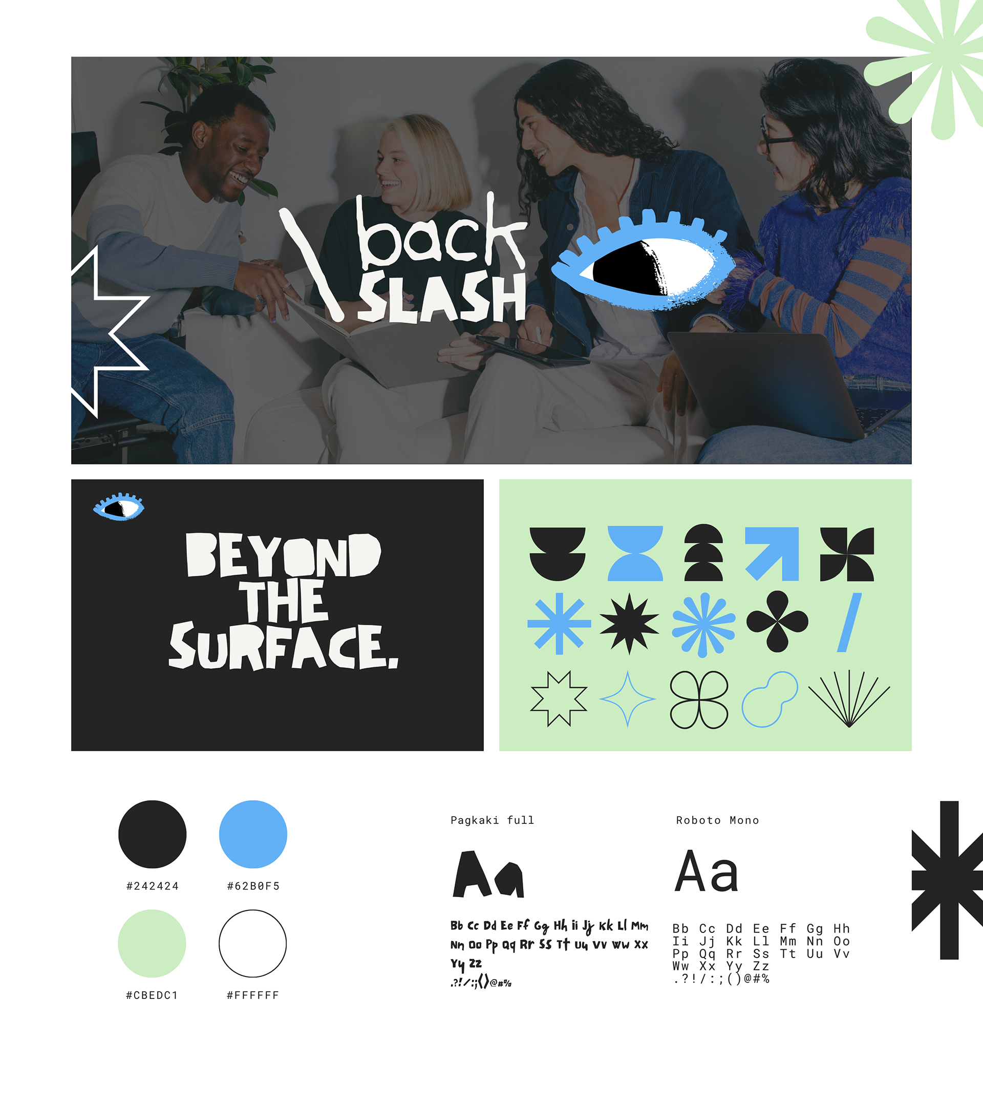
Visual language
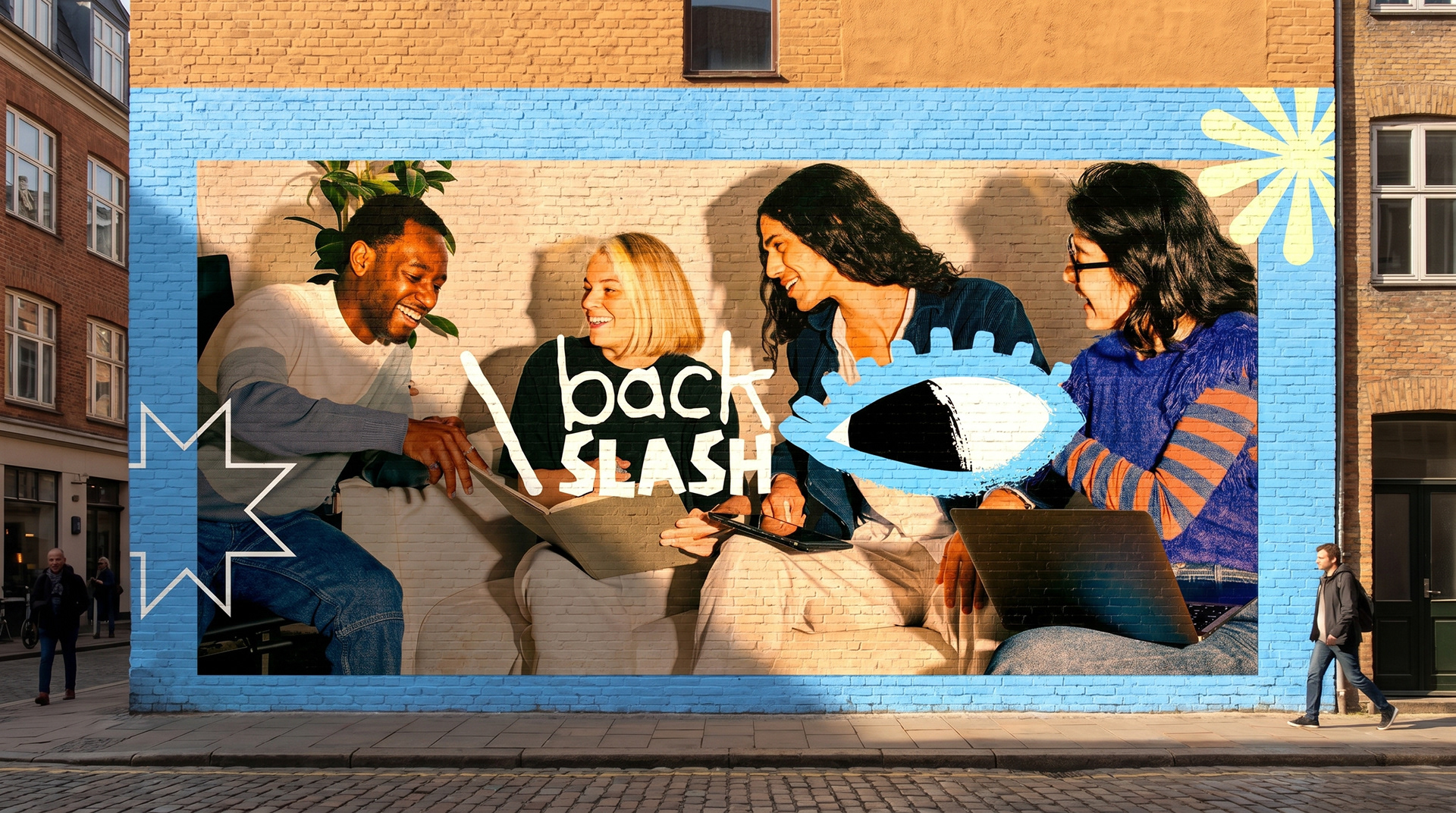
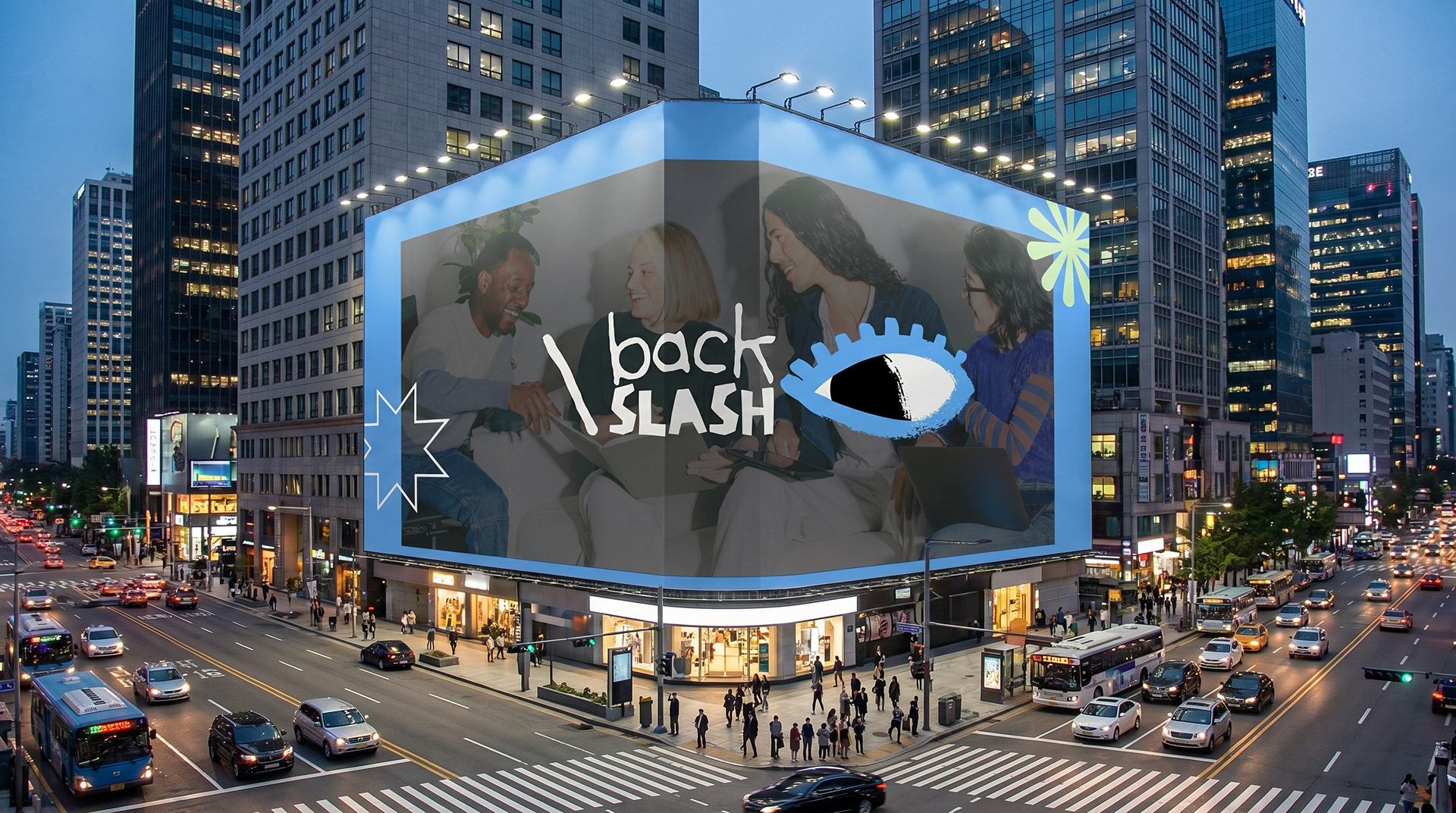
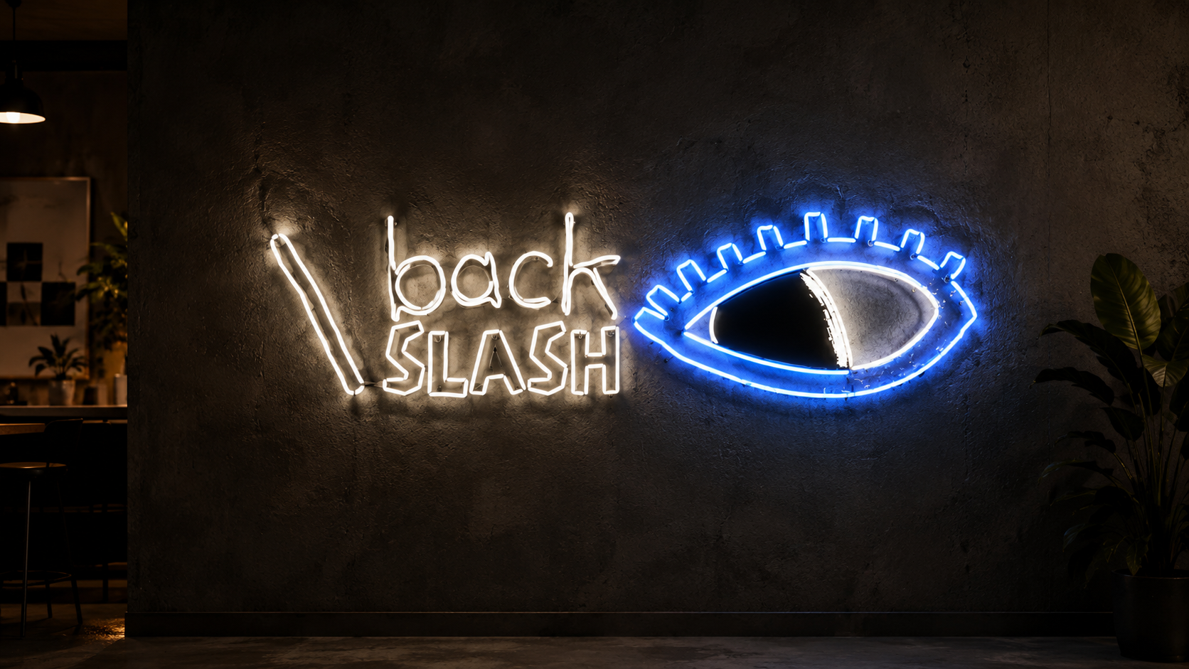
The identity uses hand-drawn typography, abstract symbols, bold contrast, and the eye icon to represent looking deeper, questioning what is obvious, and going beyond the surface. The slash becomes a visual signature, while the blue, green, black, and white palette gives the brand a fresh but edgy personality.
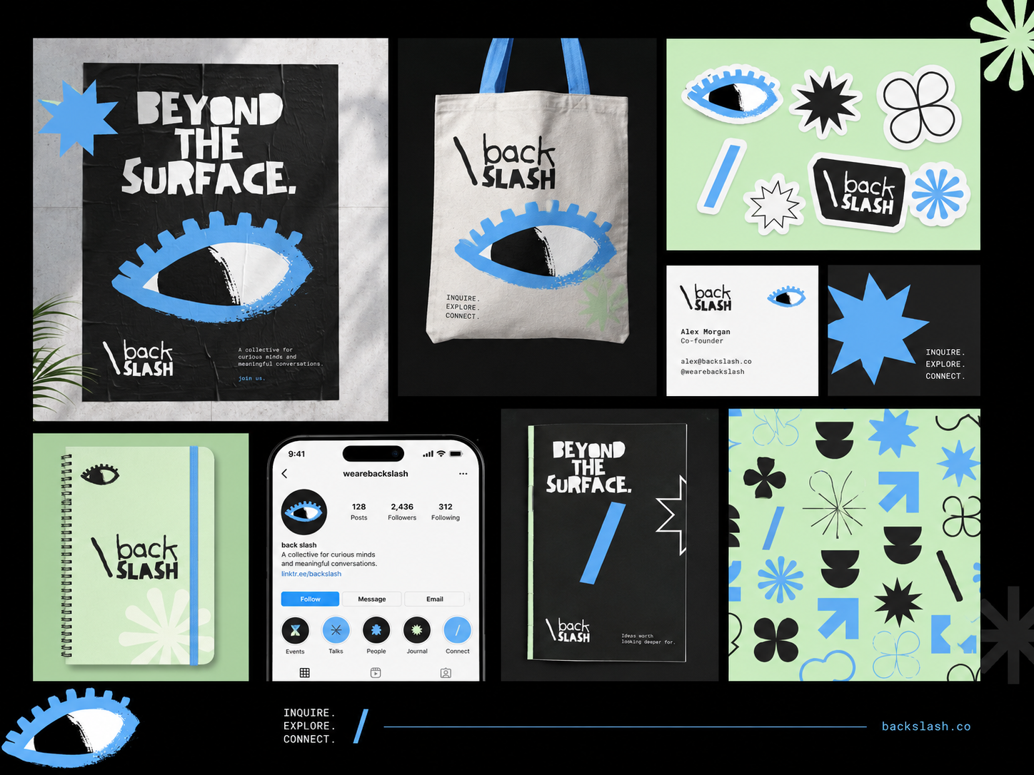
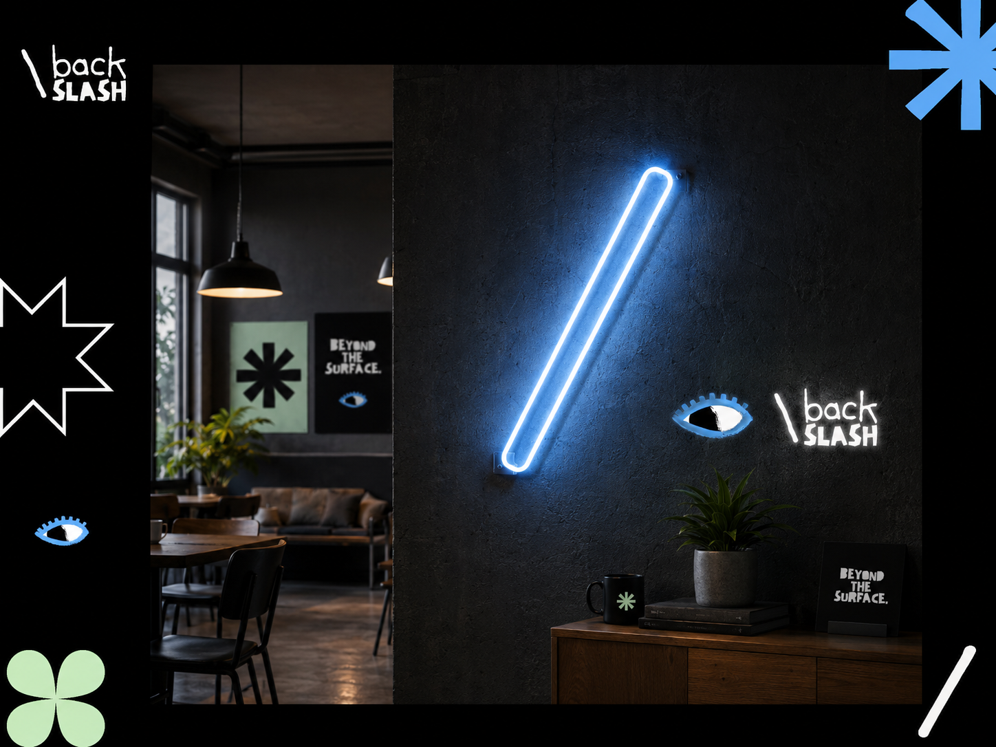
Mock-ups
Overall, Back Slash is designed to feel like a creative collective with its own language — distinctive, unconventional, and flexible enough to live across posters, merchandise, social media, stickers, and community-driven experiences.
Logo Animation
The logo animation was designed to extend the mysterious and niche personality of Back Slash. Instead of using a clean digital motion style, the animation leaned into a mystic, stop-motion feel, making the identity appear as if it is being discovered piece by piece.